Dining Room Reveal
Linnea A.
After years without having a proper dining area, I decided that it was about time to introduce one to my space - and I’m so happy I did! When I originally moved into my condo, I brought all the furniture I had from my previous condo, so my office furniture ended up in my main living space. It worked, for a little while, but I got bored of it pretty quickly, and I felt like I was wasting a ton of valuable space. I haven’t really shown much of my “process” to you guys before, so I thought I would share the before and after, and how the full design came to life.
Before
Design plan
After
The table…
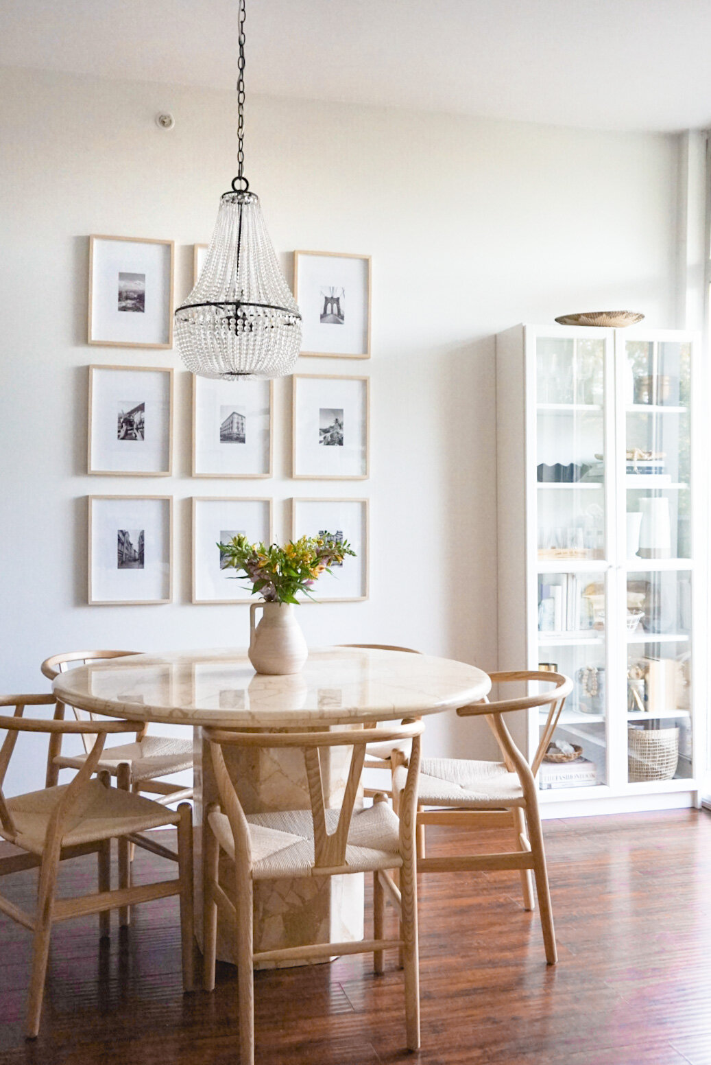
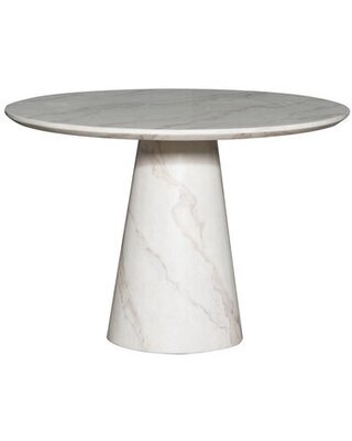
I started by gathering dining room inspiration in this post, and after months of searching, I finally found the marble pedestal table of my dreams… on Facebook Marketplace of all places (I know, I’m sorry guys, but I’ve linked similar ones below)! Once I found it, everything fell into place. I lowered my light fixture, selected chairs, a wall cabinet, frames for a gallery wall, and sold everything in my space that no longer served me or suited the room.
The chairs…
I was going back and forth between a few different dining chairs, but in the end, I chose Wishbone Chairs from Eternity Modern, made of Natural Solid Ash. They’re classic, they suit the tones of the table, they’re comfortable, and they’re a timeless Scandinavian design by Hans Wegner.
To be honest, when they arrived, I wasn’t quite sure about them. They stuck out from the table a little more than I had hoped (because the arms hit the table), so to solve my problem, I did a little DIY hack. I got a piece of plywood cut to size at RONA, and placed it under my marble tabletop to raise the table by 3/4”. Once I did that, the chairs were absolutely perfect. They tucked under the table exactly how I envisioned them, and now I’m completely obsessed!
The gallery wall…
For the gallery wall, I purchased Ikea Hovsta frames, which I intended on customizing with new mats to fit 4x6 photos. Instead, I took the clever advice of my friend Madison (@madisonandsuch), and placed my 4x6 travel photos in InDesign, added a drop shadow, and printed 12x16 photos to fill the entire frame. Madison, you’re a genius!!!!
I sold my bookshelf to make room for the Billy Oxberg Cabinet to act as my buffet for all of my entertaining needs. Originally, I was thinking of purchasing this jute rug for the dining area, but there simply wasn’t enough space for two rugs in my space, and I’m happy with it as-is. And that, my friends, is my new dining area. I hope you enjoy the tour!
I’ve linked as many products below as I can, but let me know if you have any questions! Need help with furniture selects or putting your space together? Shoot me an email at linneacarmen@gmail.com. I’m always happy to help!
xo
Linnea


