123 Street Avenue, City Town, 99999

(123) 555-6789

email@address.com


You can set your address, phone number, email and site description in the settings tab.
Link to read me page with more information.

Home

Filtering by Tag: Interior Styling

H&M Home Favourites

Linnea A.

DSC04339.JPG

Hey lovelies, it’s been a minute. Today I’m bringing the blogging back with some of my favourite H&M Home finds. I’ve loved H&M ever since I discovered it in Sweden before it’s arrival in North America (a VERY long time ago), and their home items kill it every season, no fail. These items do sell out very very fast, so if you see something you like, you better make that purchase asap (or set up notifications for when it comes back in stock)! I’m sharing some of my faves from their current collection, but be warned, some of it may already be sold out. Happy shopping!

Fall Living Room Tour

Linnea A.

IMG_3295.JPG

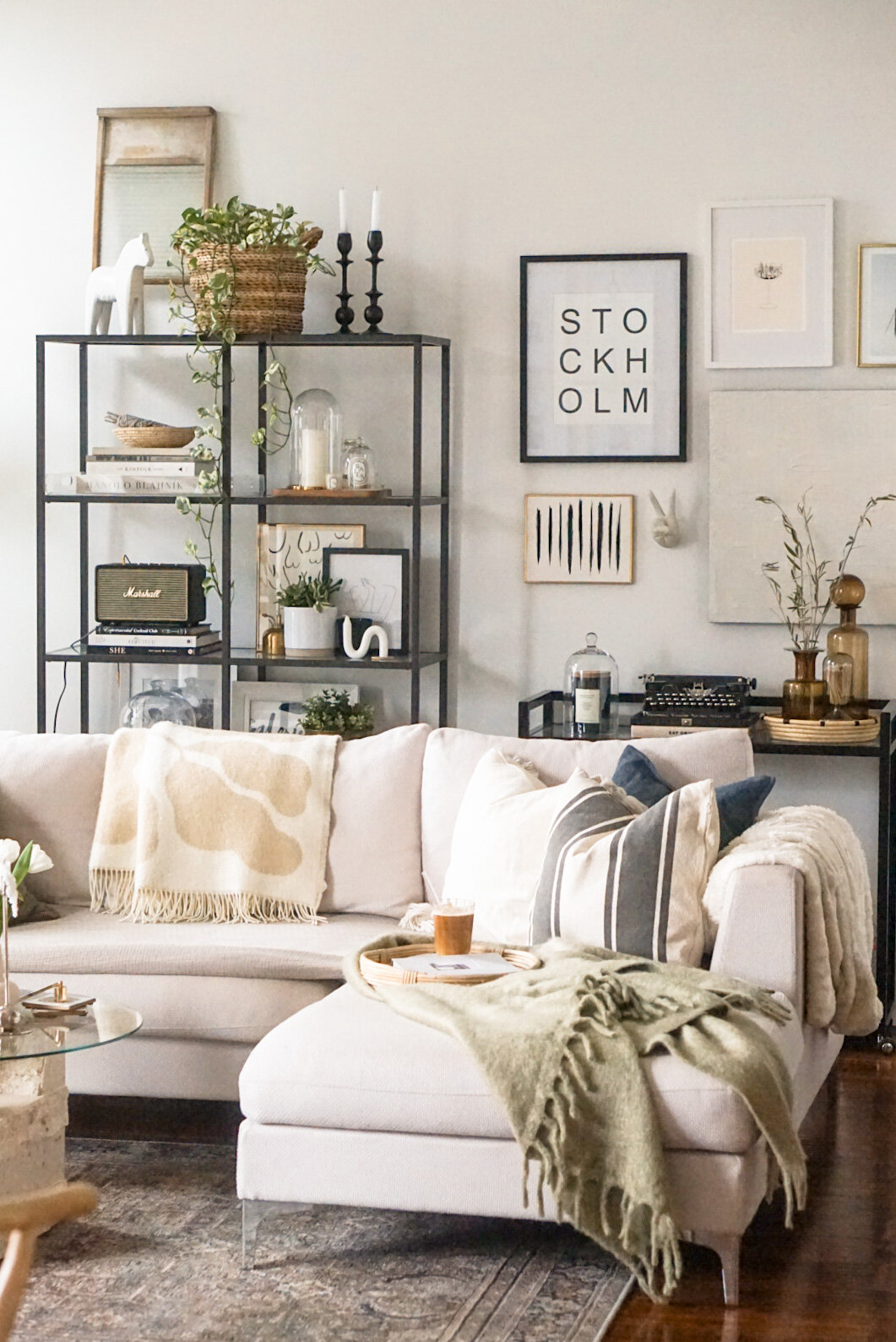
If you follow me on Instagram (which you should be, if you’re not ;), chances are, you’ve seen photos of my living room. It’s my favourite space to photograph in my home, and when Dash is posing oh-so-nicely on the couch, how can I NOT take a photo? He’s basically begging me to. So you’ve likely already seen snippets of the room on my feed, but I’ve put off this before-and-after living room tour for far too long. Enough hiding this space from you - here it is in all its glory! And while Fall is still here, I hope you take some inspiration from some of the fall touches I’ve made. But you've been warned… the space will transform for the holidays in no time! Let’s take a peek inside while it’s still fall, shall we?

Before

As you can see in the photos, this room was large and in charge, but the original paint colour didn’t do it justice. So I needed to paint the walls before I even moved in, and it made all the difference!

08607e720dc3604e20eb7c1a220c05d106df987d.jpg

Next, I needed to plan out the space. What was the best way to arrange all of my furniture? Remember, I did have to downsize coming from my previous apartment, so I no longer had a “dining” space (nor did I really need one). So I decided to make two spaces: one for lounging, with my shelves in the background, and one for working, and displaying all the things I would in my office-I-no-longer-had.

Inspiration

alaina-kaczmarski-home-tour-the-everygirl-living-room-2.jpg
hbz-home-story-12.jpg

After

IMG_3299.JPG
IMG_3297.JPG
IMG_3458.JPG
IMG_3290.JPG
IMG_3287.JPG
IMG_3291.JPG
IMG_3293.JPG
IMG_3300.JPG
IMG_3301.JPG

Shop the space

Living Room

Liam Sectional | Solid Throw Pillow | Striped Throw Pillow | Coffee Table | Moroccan Pouf | Macrame | Plant Stand | Wool Throw Blanket | Braided Wool Rug | Chandelier (similar)

Console Table

White Lisa Desk | Ceramic Stool | Round Mirror | Black Papasan Chair | Vitruvi Stone Diffuser | Stoneware Pitcher

Bar Cart

Bar Cart (similar) | Gallery Wall Frames | Linnea’s Lights Reserve Candle | Candle Trio

If there’s anything you’re still looking for that I haven’t linked, just pop me a message and I’m happy to let you know! Hope you loved my living room reveal! Up next… Christmas!!

xo
Linnea

May Moodboard

Linnea A.

IMG_3845.PNG

May, you're going to be one incredible month, I can feel it! Patio parties, New York City, Toronto, DIY projects around the house, spring sunshine, plenty of time spent with my girls... the list goes on. And did I mention how excited I am to be reunited with my bests on the east coast?! Can't handle it!! Believe it or not, this will be the first trip (that's not for business) that I'm taking on my own, and I literally cannot wait to explore the Big Apple solo dolo! Let's just say I won't be surprised if I'm convinced to move there :) Let's do this May 💕

Xo

Linnea

Before & After: My Console Table

Linnea A.

IMG_2191.JPG

As one of my favourite spots in my home, my console table serves many purposes for my living room. I've used it as a desk, a makeup vanity, an extra dining table... so versatile!

IMG_2656.JPG

You seemed to love the before and after of my entryway, so I decided to do the same with this area of my home. Here's how it looked before I moved in:

The Before

0ee2c2239cdbbf815d3fe523a6d83408950cb350 6.jpg

The paint colour, the light fixture, the mirror... it all had to go. So of course, the first thing I did was paint the walls white - it makes such a tremendous difference, and it's therapeutic too.

The Inspiration 

The majority of my inspiration for this area came from Katie of Halfway Wholeistic - I love her home, and she's super sweet, too. When you're looking for inspiration, look for spaces that are similar to yours, and pick things you love from the way they're styled and decorated, using things you already have. Before you know it, you'll have all the pieces to tie it all together.

The After

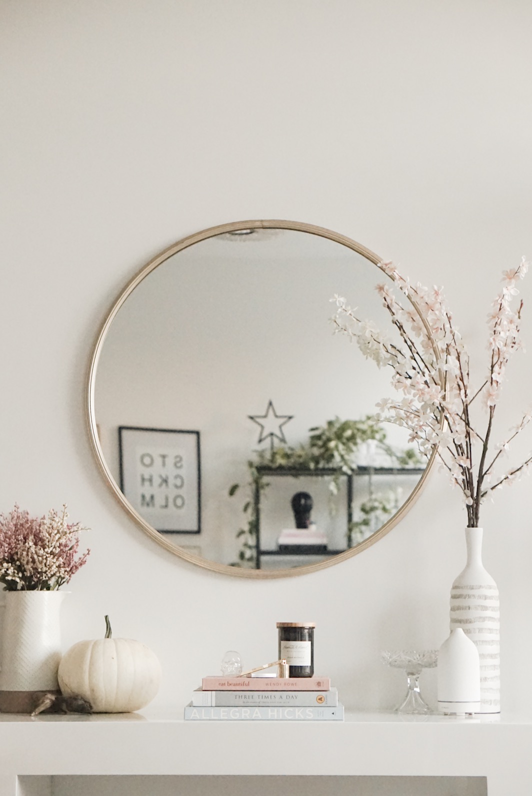
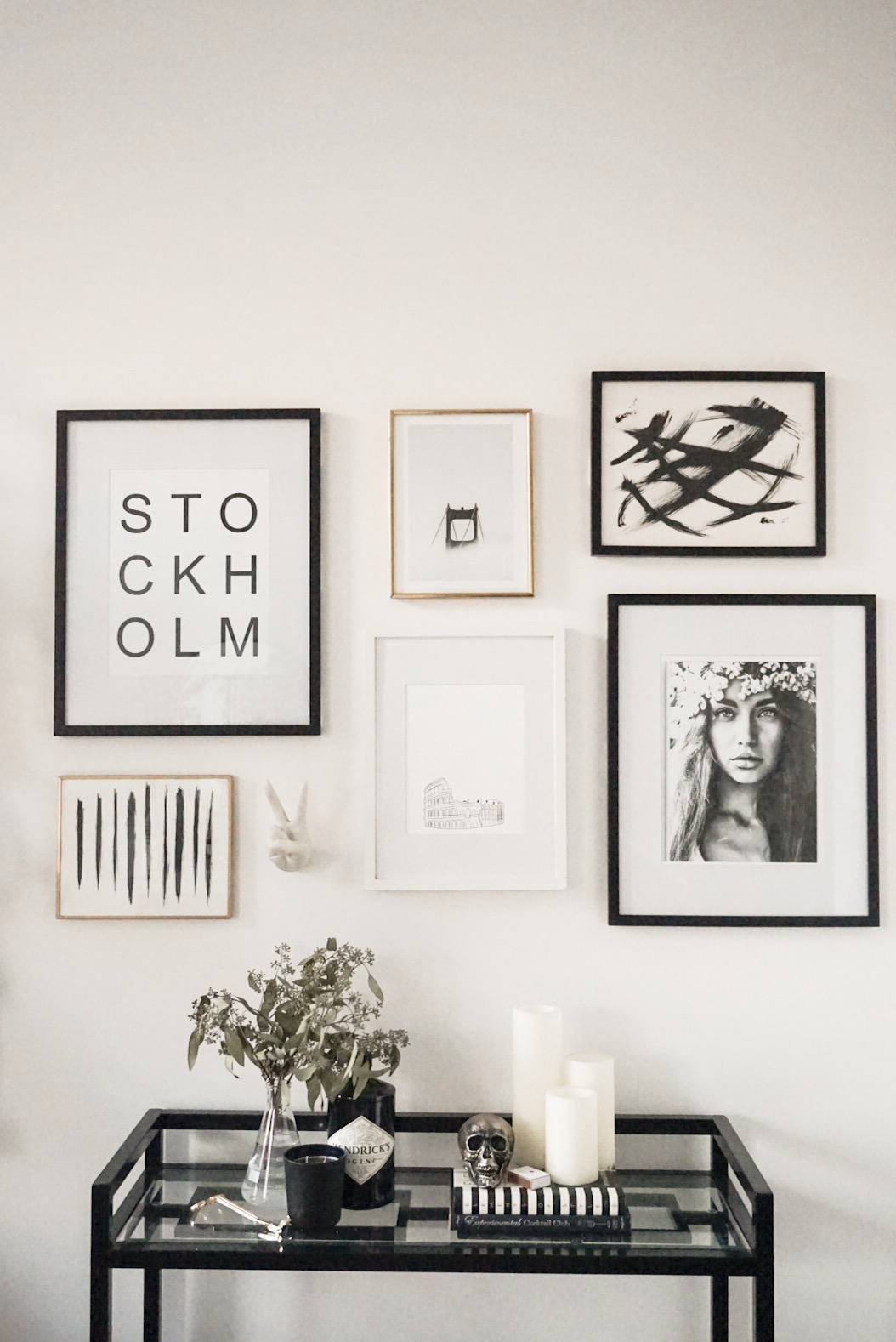
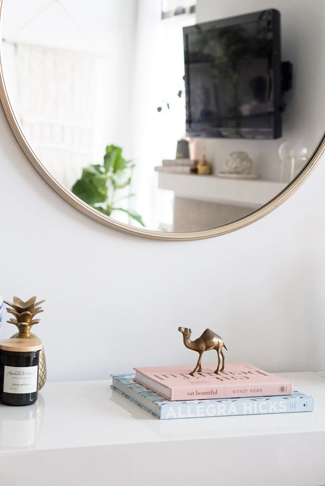
I knew I wanted a circular mirror, so I was thrilled to find one just a few weeks before moving into my new place. It's funny how things happen like that! Once the walls were painted, I replaced the awful light fixture with one I purchased while I was house hunting - probably one of my favourite things in my home. After those were in place, I accessorized around those pieces. I layered in some candles, my mom's vintage ginger vase, books, a vintage brass camel I found at a second hand shop, and of course, my diffuser.

IMG_2188.JPG
IMG_2659.JPG
IMG_2715.JPG

I change the decor on the table quite often, depending on the season or my mood, but that's the beauty of decor. Looking for console table must haves? I've linked similar options to mine below.

Shop the Look:

IMG_2724.PNG

Before & After: My Entryway

Linnea A.

IMG_1353.JPG

Entryways are a little underrated, because they're pretty much like hostesses; they're the first thing you see when you walk into a space, and the last thing you see before you leave. Because of this, they're pretty important when it comes to first (and last) impressions.

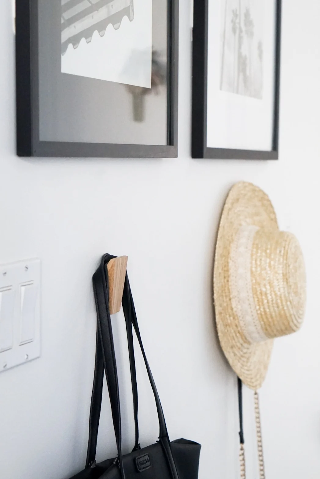
Overall, my entryway is limited in terms of size, but I still wanted to create a functional space that set the tone for the rest of the apartment. I needed some hooks for Dash's leash, my purse, and the jacket or hat I happened to be wearing that day... so the search for entryway inspo began.

IMG_1856.JPG

Major renovations weren't needed quite yet, but I still wanted to give my entryway a little face lift. Here's the transformation from move-in day to now:

The Before

2rfe.jpg

As you can see in the before photo, the walls were builders' beige, bane of my existence! The very first thing I did (even before moving in) was paint the entire apartment white. I painted the whole place with my mom - just the two of us. I was originally thinking of hiring someone to paint my place because of the extremely high ceilings, but at the end of the day, it just wasn't worth it. Plus, we know a thing or two about handling a paint brush, and we love painting!

The Inspiration

Once I established the design style of my other spaces, I moved onto the entryway. I started searching for entryway inspiration, and when Alaina Kaczmarski gave me just the inspiration I needed, I got pretty darn close to what I was looking for. All I needed were some wall hooks, prints, a light fixture, and some frames. 

The After

To begin the transformation, the light fixture just had to go. The fixtures that came with my apartment were pretty hideous (as you can see above) so I went on the hunt for a something that paired well with my other fixtures, and suited the rest of the space.

IMG_1858.JPG
IMG_1855.JPG

Next up, the frames and prints. I wanted to keep it pretty simple because I already have a gallery wall in the living room, so I stuck to two prints of similar subjects.

When you're looking for prints and photos, my best advice is to look for free high-res images (aside from your own), on Unsplash. They have so many to choose from, and 9 times out of 10, everything will match if you make it gray scale!

IMG_1857.JPG

For the hooks, I decided to opt for wood because I needed to add some warmth to the space. Once those were up, I accessorized with an umbrella stand and a doormat, and the transformation was complete!

IMG_1853.PNG

Gold Pendant (splurge) | Gold Pendant (save) | Frame & PrintWooden Wall Hooks | Umbrella Stand | Doormat

The transformation just goes to show what can be done with a little bit of paint and wall art! I'm working on giving a few other spaces some love, but in the meantime, what else would you like to see? Let me know in the comments below.

xo

Linnea

Coffee Table Books I've Been Loving

Linnea A.

IMG_1394.JPG

If you haven't already noticed, I have a slight obsession with coffee table books. Mostly those within the realm of home styling and entertaining, but I do love a good cook book as well! The purpose of my coffee tables books is threefold:

  1. To accessorize my home, scattering the books throughout my space
  2. For daily inspiration, whether that be through photos, content, styling or blog ideas
  3. To pick up and read a physical, hard cover book!
IMG_1397.JPG

I'm loving the collection I've curated thus far, so I thought I'd share a few of my favourites to get your collection started:

FullSizeRender.jpg

1. The Kinfolk Home 2. See San Francisco 3. Eat Beautiful 4. Eat Drink Nap 5. The Beauty Chef 6. The Kinfolk Table 7. All in Good Taste 8. Oh She Glows Every Day 9. Gypset Travel 

What's next on the list? Probably Magnolia Table... because #Gaines (Joanna Gaines, of course)!

xo

Linnea

Shelfie Styling 101

Linnea A.

IMG_9683.JPG

Bookshelves have been popular for a while now... and I know because I've had my trusty Ikea Vittsjö shelf ever since I moved out (almost 6 years ago, omg) and I've loved it ever since. It's been with me in every single home I've lived in, so it's grown with me throughout the years, and I've changed what it displays many, many times. Styling a shelfie  can be a little tricky, but my hope is to break it down to be a little easier for you.

IMG_9656.JPG

Clean every surface

To begin, take everything off of every shelf, and clean every surface. You can't have a sharp looking bookshelf if it's dusty!

IMG_9684.JPG

Style your books

Next, visualize where you'd like to store your books. I like to scatter my books diagonally, so that there aren't too many of the same vignettes happening next to each other. Books can be stacked either on top of one another, or with the spines displayed vertically. It really depends on the size and composition of the book! For paperback books with less-than-lovely covers, try flipping them the other way, so you have a uniform display of the neutral-toned pages. 

IMG_9654.JPG

Shop your home

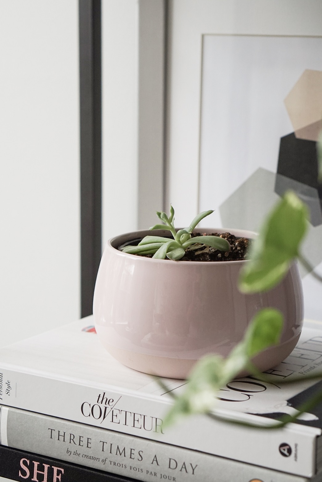
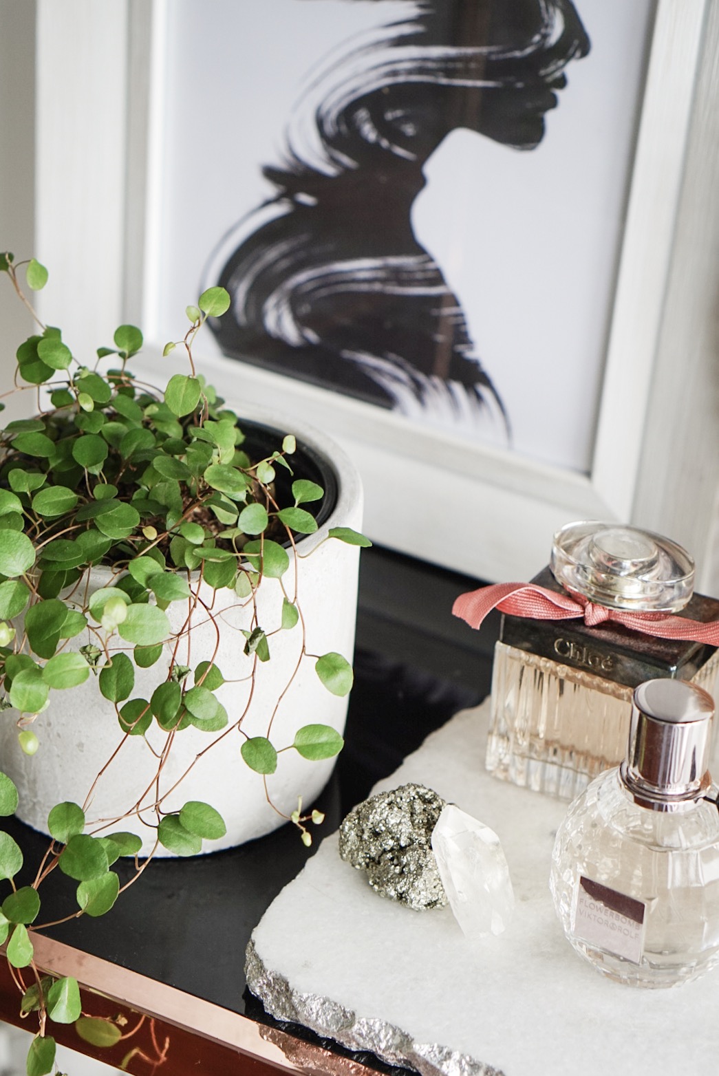
Once you're happy with the way your books look, it's time to shop your home. This is where you get out your vases, tealight holders, heirlooms, plants, frames, purses, perfumes, and whatever else you have lying around without a home. Use your books as your base, and scatter the other knick-knacks around them. Trial and error is key here!

Plants, plants, plants

Greenthumb or not, plants really do make the room come together, so make sure you have lots of them! They're super affordable, and they pair well with almost everything. 

IMG_9676.JPG

Find additional storage

One of my favourite pieces on my bookshelf is my mom's antique ginger jar. She brought two of them all the way from the Philippines when she moved to Canada, so they're sentimental pieces that I'll always have in my home (or as long as she lets me keep them lol). And bonus! They act as a great storage space for extra chargers and things I don't want lying around in plain sight.

IMG_9687.JPG

Balance is key

Make sure you balance the weight of your items, and play with varying heights. Don't be afraid to lean frames against the wall, or have plants growing off the shelves. Once you're happy with how your shelves look, take a step back, and embrace your creation! The shelf should be full of items that bring you joy, and in turn, seeing it everyday will make you happy. 

SHOP THE LOOK

 Jo Malone Cologne | Viktor & Rolf Flowerbomb | Gold plant standThe Coveteur | Three Times a Day | All in Good Taste | SHE by Kate Spade

And that's it, styling complete!

xo

Linnea